Chapter 4: The Laws of Chance#
Probability Distributions and Normality Assessment#
Dataset: Framingham Heart Study teaching subset —
framingham_teaching.csv, n = 500 participants, baseline examination.
Learning Objectives
By the end of this chapter, you will be able to:
Describe the Normal, Binomial, and Poisson distributions and when each applies.
Apply the Empirical Rule to interpret clinical data.
Assess Normality using a histogram, Q-Q plot, and Shapiro-Wilk test.
Explain what an epidemic curve shows and how to read one.
Before You Begin: From Outcomes to Probabilities#
Chapters 1 through 3 described data. Now we use mathematical models — probability distributions — to ask: how likely is a given outcome?
In cardiovascular epidemiology, this means: given a population with a mean cholesterol of 235 mg/dL, how likely is it that a randomly selected participant has cholesterol above 300 mg/dL? Given a 31% 10-year CHD event rate, how surprising would it be if 45 out of a new sample of 100 patients had events? Those questions are the statistical engine behind every hypothesis test you will learn in Chapters 5 through 8.
Section 1: Three Distributions That Matter#
1.1 Properties of the Normal Distribution#
💡 Plain English first: Many biological measurements — height, blood pressure, cholesterol — cluster heavily around a middle value and tail off symmetrically in both directions. That bell-shaped pattern is the Normal distribution.
The Normal distribution is completely defined by two parameters: the mean (\(\mu\)) and the standard deviation (\(\sigma\)).
The Empirical Rule:
68% of observations fall within \(\mu \pm 1\sigma\)
95% fall within \(\mu \pm 1.96\sigma\)
99.7% fall within \(\mu \pm 3\sigma\)
Clinical application — Framingham SYSBP: With \(\mu = 132\) mmHg and \(\sigma = 22\) mmHg:
68% of participants have SYSBP between 110 and 154 mmHg.
95% have SYSBP between 89 and 175 mmHg.
A participant with SYSBP = 190 mmHg sits \((190-132)/22 = 2.6\) SDs above the mean — placing them in the top 0.5% of the distribution.
Z-score: $\(z = \frac{x - \mu}{\sigma}\)$
A z-score expresses exactly how many standard deviations an observation lies from the mean, enabling you to compare risk across variables with entirely different units. A z-score of \(0\) is exactly average, a positive score is above average, and a negative score is below average.
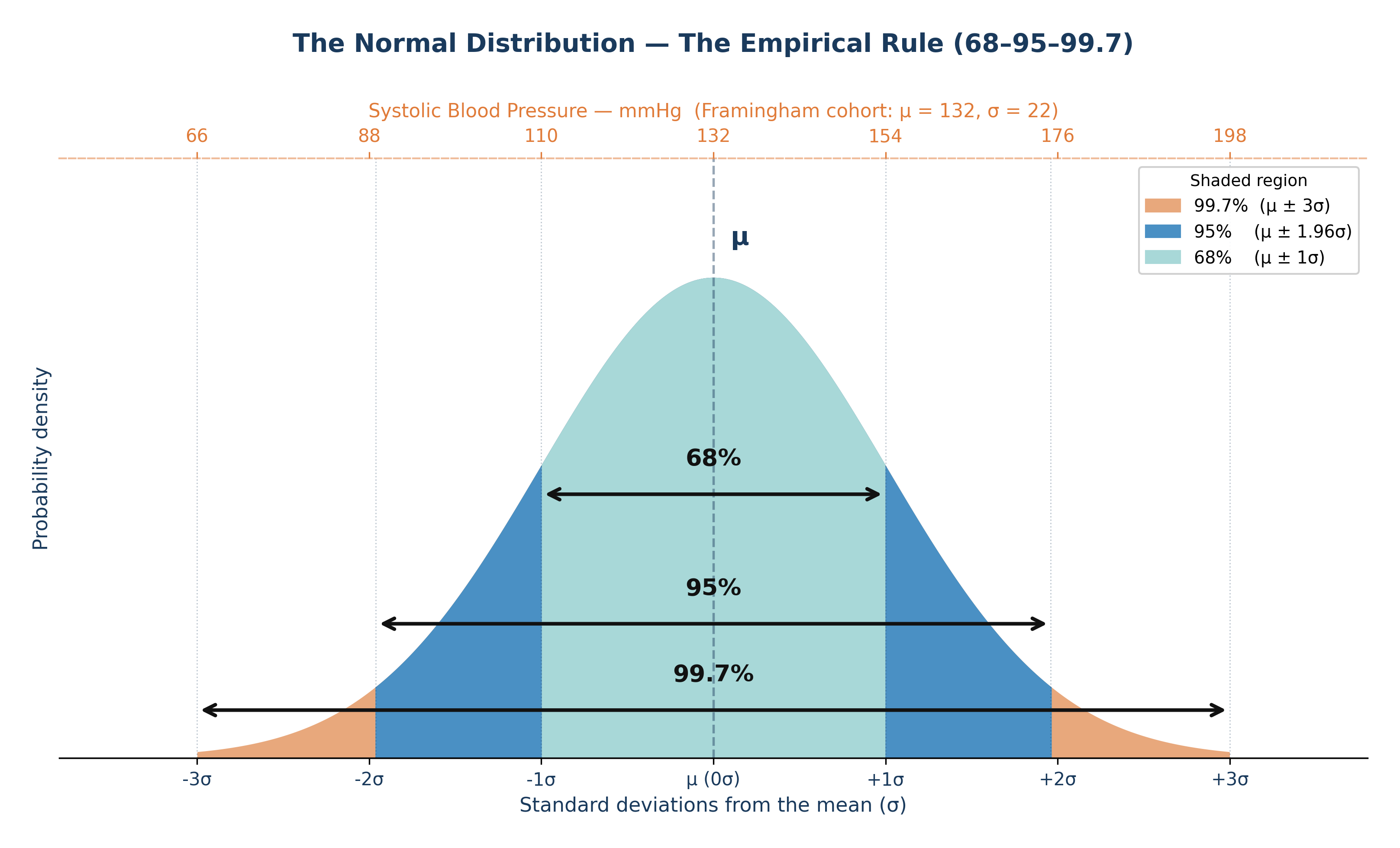
Fig. 8 Figure 4.1 The Normal distribution with the Empirical Rule. In the Framingham cohort, systolic blood pressure is approximately Normal with μ ≈ 132 mmHg and σ ≈ 22 mmHg. The 68% band spans roughly 110–154 mmHg; the 95% band spans roughly 89–175 mmHg.#
1.2 The Binomial Distribution#
💡 Plain English first: The Binomial distribution counts how many “successes” occur in a fixed number of yes/no trials. Each trial must have the exact same probability of success.
When to use it: A fixed number of independent binary trials (\(n\)), with a constant probability of the event occurring (\(p\)).
Framingham context: 31% of the 500 participants had a CHD event during follow-up. If we take a new random sample of 50 Framingham-like participants, what is the probability that exactly 15 of them have CHD events?
With \(n = 50\) and \(p = 0.31\): \(P(X=15) = \binom{50}{15}(0.31)^{15}(0.69)^{35}\)
The Binomial formula calculates this precise probability without needing to assume anything about the underlying biology.
1.3 The Poisson Distribution#
💡 Plain English first: The Poisson distribution counts how many times a rare event occurs per unit of time or space.
When to use it: Rare, independent events occurring at a constant average rate (\(\lambda\)) per unit.
Cardiovascular epidemiology context: If severe heart attacks occur at an average rate of \(\lambda = 2.3\) per 1,000 person-years in this cohort, the Poisson distribution describes exactly how many heart attacks we would expect to see in any given year in a local clinic of 200 patients.
⚡ Epidemiology Pro-Tip: A unique property of a true Poisson distribution is that its mean and its variance are exactly identical (both equal \(\lambda\)). If your data’s variance is much larger than its mean, the data is “overdispersed,” and a standard Poisson model may not be appropriate.
Section 2: The Central Limit Theorem#
The Central Limit Theorem (CLT) is the mathematical foundation of all hypothesis testing:
Regardless of the shape of the underlying population distribution, the distribution of sample means approaches a Normal distribution as the sample size increases — provided \(n\) is sufficiently large (typically \(n \geq 30\)).
Why this matters: CIGPDAY (cigarettes per day) in the Framingham dataset is severely right-skewed — 49% of participants smoke 0, and a few smoke 40 to 60 per day. The distribution of individual values is far from Normal. But with \(n = 500\), the CLT mathematically guarantees that the sampling distribution of the mean is approximately Normal. This is the “magic” that makes t-tests valid even when your individual raw data is skewed.
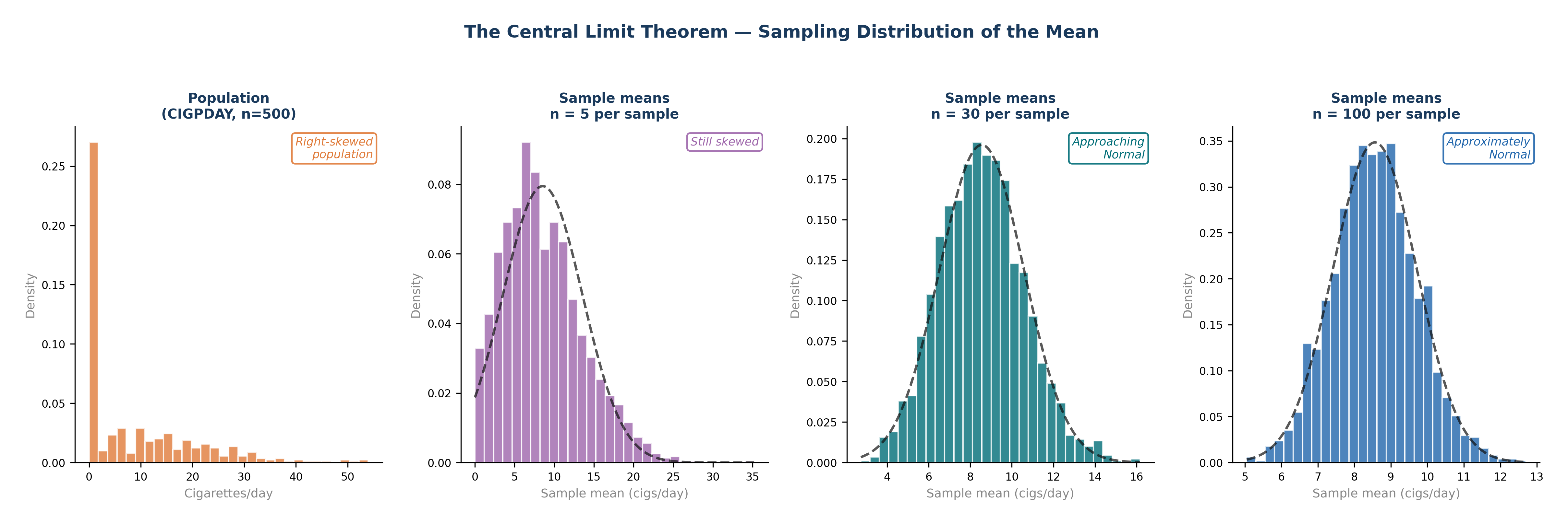
Fig. 9 Figure 4.4 The Central Limit Theorem in Action. The Framingham CIGPDAY variable is severely right-skewed — 49% of participants are non-smokers. As sample size increases from n = 5 to n = 100, the sampling distribution of the mean progressively approaches a Normal distribution (dashed curve), regardless of the shape of the original population. By n = 30, the distribution is already approximately Normal. This is why t-tests remain valid even when raw data is skewed, provided n ≥ 30.#
Section 3: Epidemic Curves — Reading Disease Over Time#
An epidemic curve (Epi Curve) is a histogram where the x-axis represents time and each bar represents the number of new cases in that specific period. Reading the shape of the curve tells you how a disease spreads.
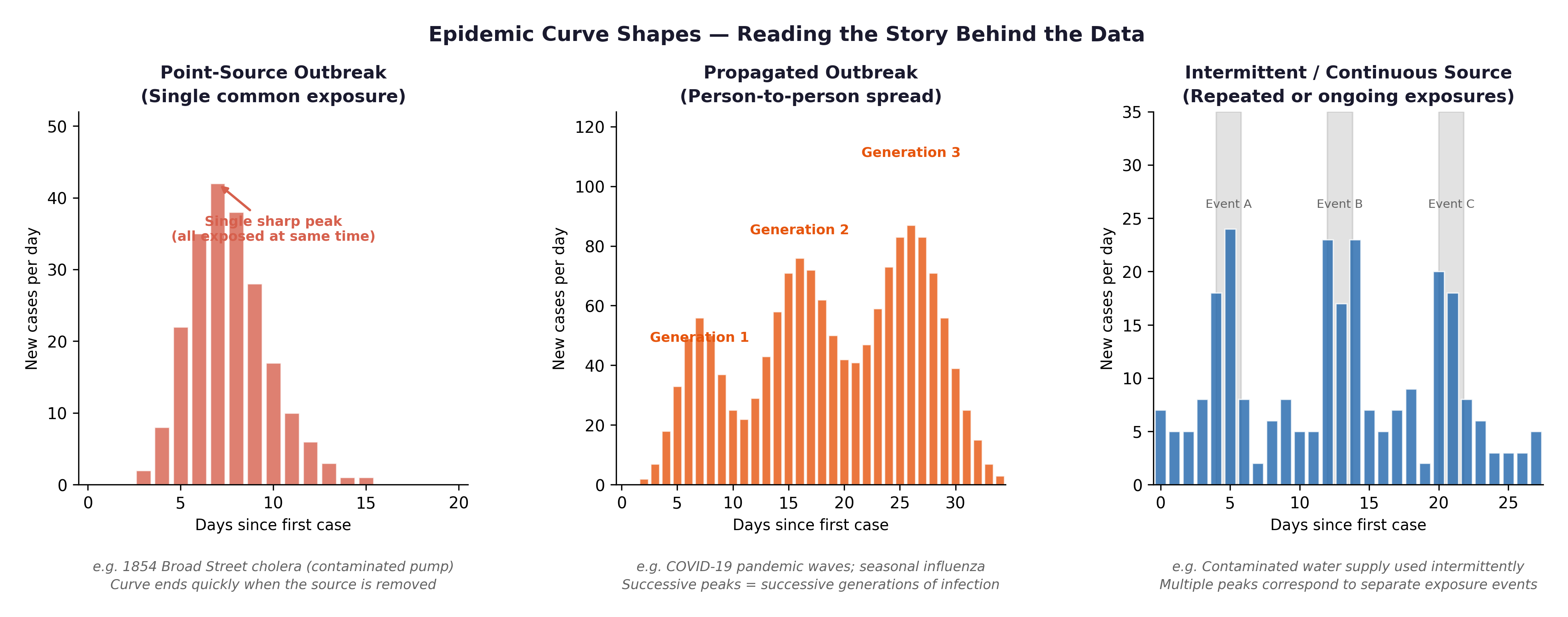
Fig. 10 Figure 4.2 Three epidemic curve shapes: point source (single sharp peak — e.g., a contaminated food event), propagated (successive waves — person-to-person transmission), and endemic (roughly constant background rate). Cardiovascular disease is endemic, a persistent, ongoing cause of morbidity and mortality, not a single outbreak event.#
The Framingham connection: Cardiovascular disease is not an infectious outbreak — it is an epidemic in the broad public health sense: a disease occurring at higher-than-expected rates over a sustained period. The Framingham Study was designed precisely because heart disease had become the leading cause of death in post-war America and no one yet understood why. Plotting incident CHD events by year in the Framingham cohort produces an endemic-pattern curve—a persistent baseline incidence, not a single-source spike.
Section 4: Normality Assessment#
Before applying parametric tests (like t-tests and ANOVA), you must assess whether your continuous outcome variable is approximately Normally distributed.
4.1 The Histogram#
A histogram of a Normally distributed variable should appear approximately bell-shaped.
For
SYSBP: Expect an approximately Normal histogram — slightly right-skewed due to hypertensive outliers.For
TOTCHOL: Similarly approximately Normal with a slight right tail.For
CIGPDAY: Expect a severely right-skewed histogram — a massive spike at 0, with a long right tail.For
BMI: Expect slight right skew — most participants fall in the normal-to-overweight range, with fewer in the obese range.
4.2 The Q-Q Plot#
A Q-Q (Quantile-Quantile) plot compares your observed data distribution against what a perfect theoretical Normal distribution would predict.
Points hugging the diagonal line \(\rightarrow\) approximately Normal.
Points curving upward at the right \(\rightarrow\) positive skew (right tail).
Points bowing away at both ends \(\rightarrow\) heavy tails.
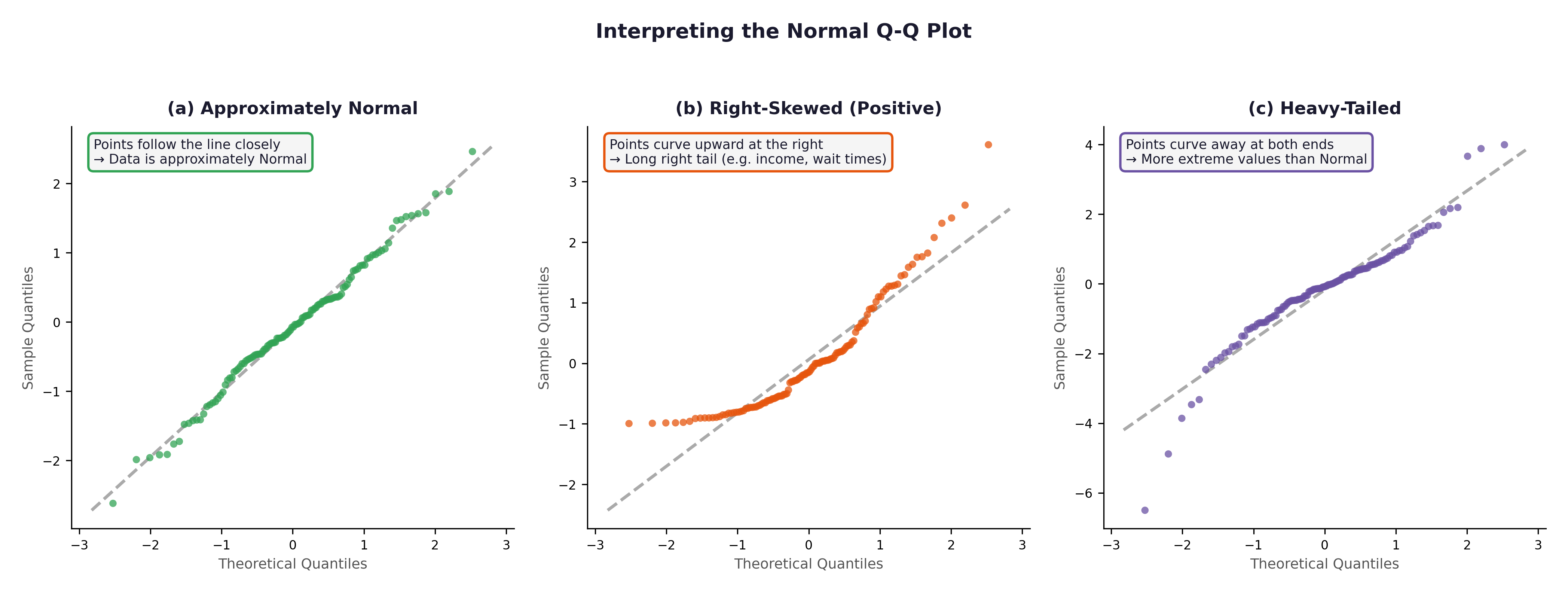
Fig. 11 Figure 4.3 Three Q-Q plots. (a) Approximately Normal — SYSBP in the Framingham cohort would resemble this. (b) Right-skewed — CIGPDAY or GLUCOSE would show this pattern. (c) Heavy-tailed — rare in the Framingham variables but important to recognise.#
4.3 The Shapiro-Wilk Test#
The Shapiro-Wilk test is a formal statistical test for Normality.
\(H_0\): The data comes from a Normal distribution.
p > 0.05: No significant departure from Normality detected. We assume it is Normal enough.
p \(\leq\) 0.05: Significant departure from Normality.
⚡ Common mistake: With \(n = 500\), the Shapiro-Wilk test becomes hyper-sensitive and will flag even trivial, microscopic departures from Normality as “statistically significant.” At this large sample size, trust the visual evidence of the histogram and Q-Q plot over the Shapiro-Wilk p-value. A minor, clinically irrelevant asymmetry will produce \(p < 0.05\) purely because of the large sample size.
🔬 Lab Manual — Chapter 4#
Objective#
Assess the Normality of SYSBP, TOTCHOL, BMI, and CIGPDAY. Plot an incidence-over-time chart for CHD events. Use R to calculate probabilities for the Binomial and Poisson distributions.
Option A — PSPP#
Graphs → Chart Builder → Histogram → drag
SYSBPto x-axis → tick “Display normal curve” → OK.Analyze → Descriptive Statistics → Explore → add
SYSBP,TOTCHOL,CIGPDAY→ under Plots tick “Normality plots with tests” → OK.
Option B — R / RStudio#
# -------------------------------------------------------
# Chapter 4 Lab: Distributions and Normality
# -------------------------------------------------------

fram_data <- read.csv("data/framingham_teaching.csv")

# ── Part 1: Probability Distributions ──────────────────

# Binomial: Probability of exactly 15 events in 50 trials (p=0.31)
dbinom(x = 15, size = 50, prob = 0.31)
# Expected output: ~ 0.122 (There is a 12.2% chance)

# Poisson: Probability of exactly 3 heart attacks in a year (λ = 2.3)
dpois(x = 3, lambda = 2.3)
# Expected output: ~ 0.203 (There is a 20.3% chance)

# ── Part 2: Histograms ────────────────────────────────
par(mfrow = c(2, 2))

hist(fram_data$SYSBP,
     main = "Systolic Blood Pressure",
     xlab = "SYSBP (mmHg)", col = "#BDD7EE", border = "white", breaks = 20)

hist(fram_data$TOTCHOL,
     main = "Total Cholesterol",
     xlab = "TOTCHOL (mg/dL)", col = "#C7E9C0", border = "white", breaks = 20)

hist(fram_data$BMI,
     main = "Body Mass Index",
     xlab = "BMI (kg/m²)", col = "#FDD0A2", border = "white", breaks = 20)

hist(fram_data$CIGPDAY,
     main = "Cigarettes Per Day",
     xlab = "CIGPDAY", col = "#FEE0D2", border = "white", breaks = 20)

par(mfrow = c(1, 1))

# ── Part 3: Q-Q plots ─────────────────────────────────
par(mfrow = c(1, 2))
qqnorm(fram_data$SYSBP,  main = "Q-Q: SYSBP",   col="#2166AC", pch=16, cex=0.7)
qqline(fram_data$SYSBP,  col = "#C00000", lwd = 2)

qqnorm(fram_data$CIGPDAY, main = "Q-Q: CIGPDAY", col="#E6550D", pch=16, cex=0.7)
qqline(fram_data$CIGPDAY, col = "#C00000", lwd = 2)
par(mfrow = c(1, 1))

# ── Part 4: Shapiro-Wilk tests ────────────────────────
shapiro.test(fram_data$SYSBP)
shapiro.test(fram_data$TOTCHOL)
shapiro.test(fram_data$BMI)
shapiro.test(fram_data$CIGPDAY)

# ── Part 5: Incidence plot (CHD events over time) ─────
# TIMECHD gives days to event — convert to approximate year
chd_patients <- fram_data[fram_data$ANYCHD == 1, ]
chd_year <- ceiling(chd_patients$TIMECHD / 365.25)

barplot(table(chd_year),
        main = "Incident CHD Events by Follow-Up Year",
        xlab = "Year of Follow-Up",
        ylab = "Number of Events",
        col = "#FEE0D2", border = "white")
What to examine:
Variable |
Expected Histogram |
Expected Q-Q Plot |
Expected Shapiro-Wilk |
|---|---|---|---|
|
Approximately bell-shaped, slight right skew |
Points close to diagonal |
p may be borderline |
|
Approximately Normal, slight right tail |
Points near diagonal |
p may be borderline |
|
Slight right skew |
Mild curve upward at right |
p < 0.05 likely |
|
Severe spike at 0, long right tail |
Strong S-curve departure |
p << 0.001 |
🧪 Test Your Knowledge#
shapiro.test(fram_data$CIGPDAY) returns \(p < 0.001\).
(a) State \(H_0\) and \(H_1\).
(b) Interpret the result.
(c) Does this mean you cannot run any parametric tests involving CIGPDAY? Explain, with reference to the Central Limit Theorem.
Show Solution
# (a) H_0: CIGPDAY comes from a Normal distribution.
#     H_1: CIGPDAY does not come from a Normal distribution.

# (b) p < 0.001: Reject H_0. CIGPDAY departs significantly from Normality —
#     consistent with the severe spike at 0 and the long right tail.

# (c) NOT necessarily. With n = 500, the Central Limit Theorem ensures
#     that the SAMPLING DISTRIBUTION OF THE MEAN is approximately Normal
#     regardless of the shape of the raw data. A t-test on the mean of
#     CIGPDAY remains approximately valid. For very small subgroups
#     (e.g., n < 30), a non-parametric alternative (like the Mann-Whitney U)
#     should be used instead.
Key Terms#
Term |
Definition |
|---|---|
Normal distribution |
Symmetric, bell-shaped distribution defined by \(\mu\) and \(\sigma\). 95% falls within \(\pm 1.96\sigma\). |
Binomial distribution |
Models the count of “successes” in \(n\) binary trials with a fixed probability \(p\). |
Poisson distribution |
Models the count of rare events at a constant average rate \(\lambda\) per unit time/space. |
Central Limit Theorem |
Sample means approach a Normal distribution as \(n\) increases, regardless of the population’s shape. |
Epidemic curve |
A histogram of new cases over time; its shape reveals transmission patterns. |
Q-Q plot |
A quantile-quantile plot comparing observed data against theoretical Normal quantiles. |
Shapiro-Wilk test |
A formal statistical test of Normality. \(p > 0.05 \rightarrow\) no significant departure detected. |
Review Questions#
Using the Empirical Rule and the Framingham SYSBP values (\(\mu = 132\), \(\sigma = 22\)), what proportion of participants would you expect to have a SYSBP above 176 mmHg? Is a value of 176 mmHg highly unusual in this cohort?
In the Framingham dataset, 31% of participants had a CHD event. If you drew a new sample of 80 participants from the exact same population, what distribution would you use to model the number of CHD events? Identify \(n\) and \(p\).
Run
hist(fram_data$CIGPDAY)in R. Describe the shape. Why is this distribution shaped the exact way it is, given the sample demographics?A Shapiro-Wilk test on
SYSBPreturns \(p = 0.04\) with \(n = 500\). Should you conclude that SYSBP is not Normally distributed for practical purposes? Explain, referencing the CLT.Explain the difference between a point-source epidemic curve and a propagated outbreak curve. Which specific pattern would you expect for cardiovascular disease incidence, and why?
Key Takeaways
Normal: bell-shaped; 68/95/99.7% fall within \(\pm\) 1/2/3 SDs.
Binomial: counts successes in \(n\) binary trials with fixed \(p\).
Poisson: counts rare events at rate \(\lambda\) per unit of time/space.
CLT: sample means \(\rightarrow\) Normal for \(n \geq 30\), even if raw data is heavily skewed.
Normality check: combine histogram + Q-Q plot + Shapiro-Wilk. With large samples (\(n > 100\)), visual tools are much more informative than the Shapiro-Wilk p-value alone.
Epidemic curve: shape reveals the outbreak source and transmission pattern.
Next: Chapter 5 — The Hypothesis Gamble uses these distributions to build formal hypothesis tests.
Part II — Testing What We Think We Know