Chapter 8: Reading the Future#
Correlation, Regression, and Survival Analysis#
Datasets:
Framingham Heart Study teaching subset (
framingham_teaching.csv, n = 500) — ObservationalAnorexia Clinical Trial (
anorexiaviaMASSpackage, n = 72) — Experimental
Learning Objectives
By the end of this chapter, you will be able to:
Calculate and interpret Pearson’s r and Spearman’s rho.
Distinguish correlation from causation with specific clinical examples.
Fit and interpret a simple linear regression model.
Read and construct a Kaplan-Meier survival curve.
Interpret and run the log-rank test.
Explain why OLS regression is not valid for censored survival data.
Before You Begin: From Groups to Relationships and Survival#
Chapters 5 through 7 asked: are these groups different? This chapter asks two new questions:
How are two continuous variables related? — Correlation and regression.
How do we analyse time-to-event data? — Survival analysis.
Both questions are essential in health science. Does age predict blood pressure? Does a patient’s baseline weight predict their final weight after therapy? And, the clinical question that defined Framingham—does smoking shorten the time to a cardiovascular event?
Section 1: Correlation#
1.1 Pearson’s r#
💡 Plain English first: Pearson’s r is a single number ranging from −1 to +1 that captures how strongly two variables move together in a straight-line pattern.
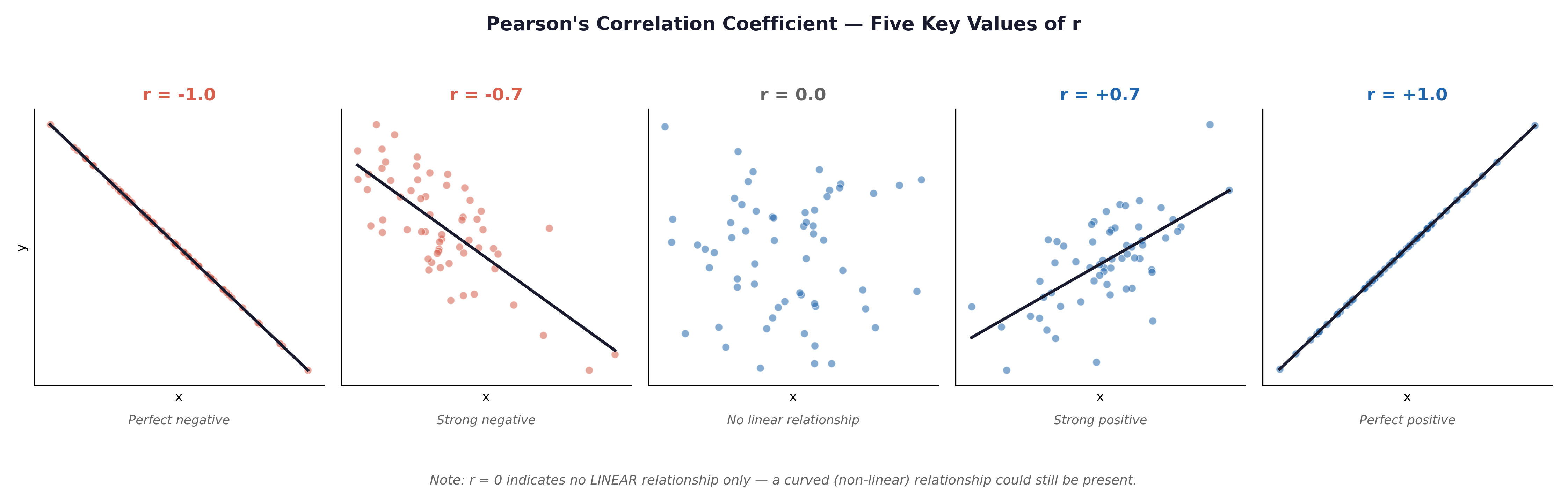
Fig. 21 Figure 8.1 Scatterplots illustrating Pearson’s r from −1.0 to +1.0. In the Framingham dataset, AGE and SYSBP would show a moderate positive correlation (r ≈ +0.3 to +0.4); AGE and BMI a weak positive correlation; SYSBP and DIABP a strong positive correlation (both measure blood pressure in the same patient).#
Framingham examples:
AGE vs SYSBP: Moderate positive r — older participants tend to have higher systolic blood pressure.
SYSBP vs DIABP: Strong positive r — they are two measures from the same cardiovascular system.
TOTCHOL vs BMI: Weak to moderate positive r — higher body weight is associated with higher cholesterol, but the relationship is noisy.
Assumptions of Pearson’s r:
Both variables are continuous (interval or ratio).
There is a linear relationship (always check with a scatterplot first).
Approximate bivariate Normality.
No severe outliers.
1.2 Spearman’s Rho#
Spearman’s rho (\(\rho\)) correlates the ranks of variables rather than their raw mathematical values. Use it when:
Data is ordinal (e.g.,
EDUC).Data is continuous but heavily skewed (e.g.,
CIGPDAY— cigarettes per day).Severe outliers are present.
1.3 Correlation Is Not Causation#
A large, statistically significant r does not prove causation. Three alternative explanations always exist.
Explanation |
Framingham Example |
|---|---|
Confounding |
AGE correlates with both SYSBP and TOTCHOL — age is a confounding variable driving a spurious BP–cholesterol correlation. |
Reverse Causation |
Does high blood pressure cause high BMI, or does high BMI cause high blood pressure? |
Coincidence |
In large datasets, completely unrelated variables will occasionally correlate by pure mathematical chance. |
The Framingham Study was longitudinal—participants were followed over time, and risk factors were measured before outcomes occurred. This temporal ordering (exposure before disease) is necessary, but still not sufficient, for causal inference. Confounding by unmeasured variables is always a risk in observational epidemiology.
Section 2: Simple Linear Regression#
2.1 The Regression Equation#
Framingham example: Does age predict systolic blood pressure?
\(x\) = AGE (The predictor / independent variable)
\(\hat{y}\) = Predicted SYSBP (The outcome / dependent variable)
\(\beta_0\) = The intercept (Predicted SYSBP when AGE = 0)
\(\beta_1\) = The slope (Change in predicted SYSBP for each additional year of age)
If \(\beta_1 = 0.6\), this means: Each additional year of age is associated with a predicted increase of 0.6 mmHg in systolic blood pressure.
⚡ The Danger of Extrapolation: \(\beta_0\) tells us the predicted blood pressure for a 0-year-old (a newborn). However, the youngest person in the Framingham cohort is 32. Using a regression model to predict outcomes for values outside the original data range is called extrapolation. It is highly dangerous and often produces biologically impossible numbers.
Anorexia Trial example: Does a patient’s weight before treatment (Prewt) predict their final weight after treatment (Postwt)?
Here, we can fit a regression line to see if heavier patients at baseline remain heavier at follow-up, or if the therapy equalizes their outcomes.
2.2 Why Use AGE → SYSBP or Prewt → Postwt for Regression?#
In both examples above, the variables are continuous ratio measurements. Neither is censored. OLS (Ordinary Least Squares) regression is fully valid.
Why NOT use time-to-event variables (TIMEDTH) in OLS regression? These are censored survival data. Participants who are still alive at the end of the 10-year follow-up have their time recorded as 3,650 days, but their true time-to-death is unknown. OLS regression ignores this censoring, treating 3,650 as the actual time of death, which produces severely biased estimates. The correct method for censored data is survival analysis (Section 3).
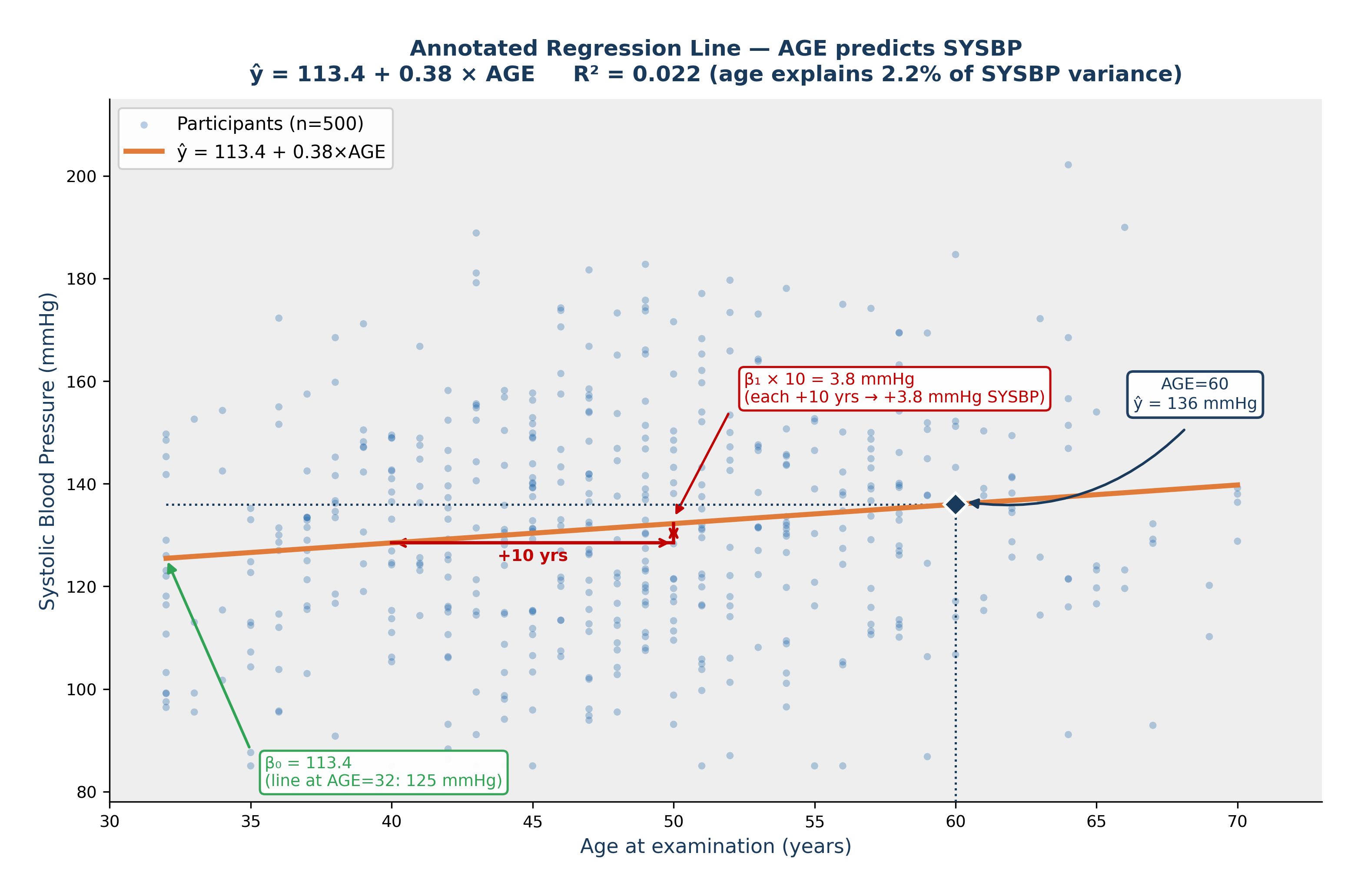
Fig. 22 Figure 8.4 Annotated Regression Line — AGE Predicts SYSBP. Fitted line: ŷ = 113.4 + 0.38 × AGE. β₀ = 113.4 mmHg (green arrow), the predicted SYSBP when AGE = 0; this is a mathematical extrapolation beyond the data range. β₁ = 0.38 mmHg/year (red triangle) — each additional year of age is associated with a predicted increase of 0.38 mmHg in systolic blood pressure. The navy diamond shows the model prediction for a 60-year-old: ŷ = 136 mmHg. R² = 0.022: age explains approximately 2.2% of the variation in SYSBP.#
2.3 The Coefficient of Determination (\(R^2\))#
💡 Plain English first: \(R^2\) tells you what proportion of the variation in the outcome is explained by your predictor. \(R^2 = 0.15\) means your predictor explains 15% of the variation—the other 85% is due to unmeasured factors and biological noise.
⚡ Common mistake: Pearson’s \(r\) and \(R^2\) are different. Pearson’s \(r\) can be negative (showing a downward slope). \(R^2\) is strictly a positive proportion (ranging from 0 to 1, or 0% to 100%).
2.4 Regression Assumptions and Diagnostic Plots#
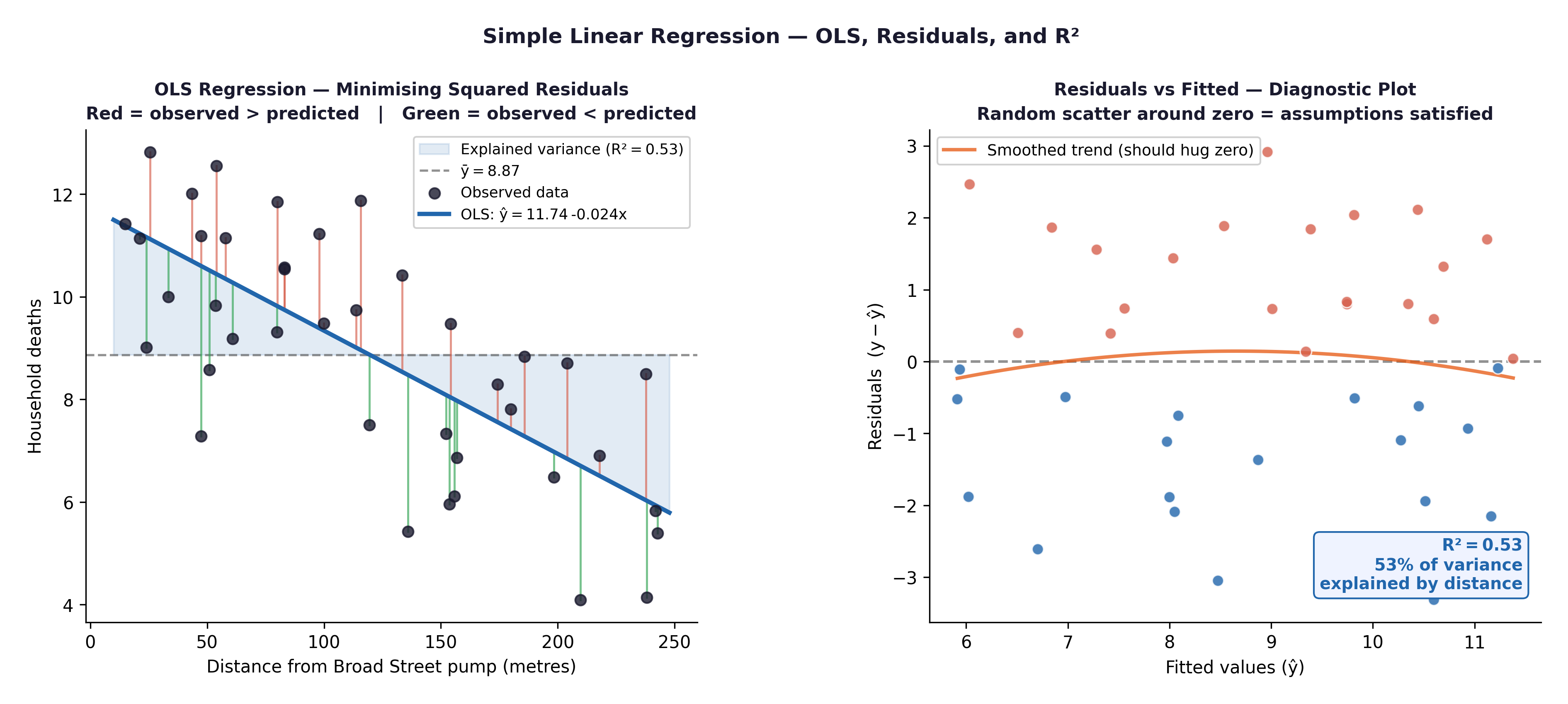
Fig. 23 Figure 8.2 Regression diagnostic plots. Residuals vs Fitted: check for patterns (linearity, homoscedasticity). Q-Q plot of residuals: check Normality. Both are produced by plot(model) in R.#
Assumption |
Diagnostic Tool |
|---|---|
Linearity |
Scatterplot; Residuals vs Fitted plot (no distinct pattern = good) |
Independence |
Verified by study design |
Homoscedasticity |
Residuals vs Fitted plot (requires an even, uniform spread of points) |
Normal residuals |
Q-Q plot of residuals (points should hug the diagonal line) |
Section 3: Survival Analysis#
3.1 Why Survival Analysis?#
The Framingham dataset contains TIMEDTH (days to death) and DEATH (0/1 indicator). Participants who were still alive at the end of follow-up have their time recorded, but their true time-to-death is unknown—they are censored observations.
Survival analysis uses specialized mathematics to handle this correctly, allowing us to use the data from patients who survived the entire study without skewing our averages.
3.2 The Kaplan-Meier Curve#
The Kaplan-Meier (KM) estimator calculates the probability of surviving beyond each specific time point, properly accounting for censoring.
At each event time \(t\), the KM survival probability is updated:
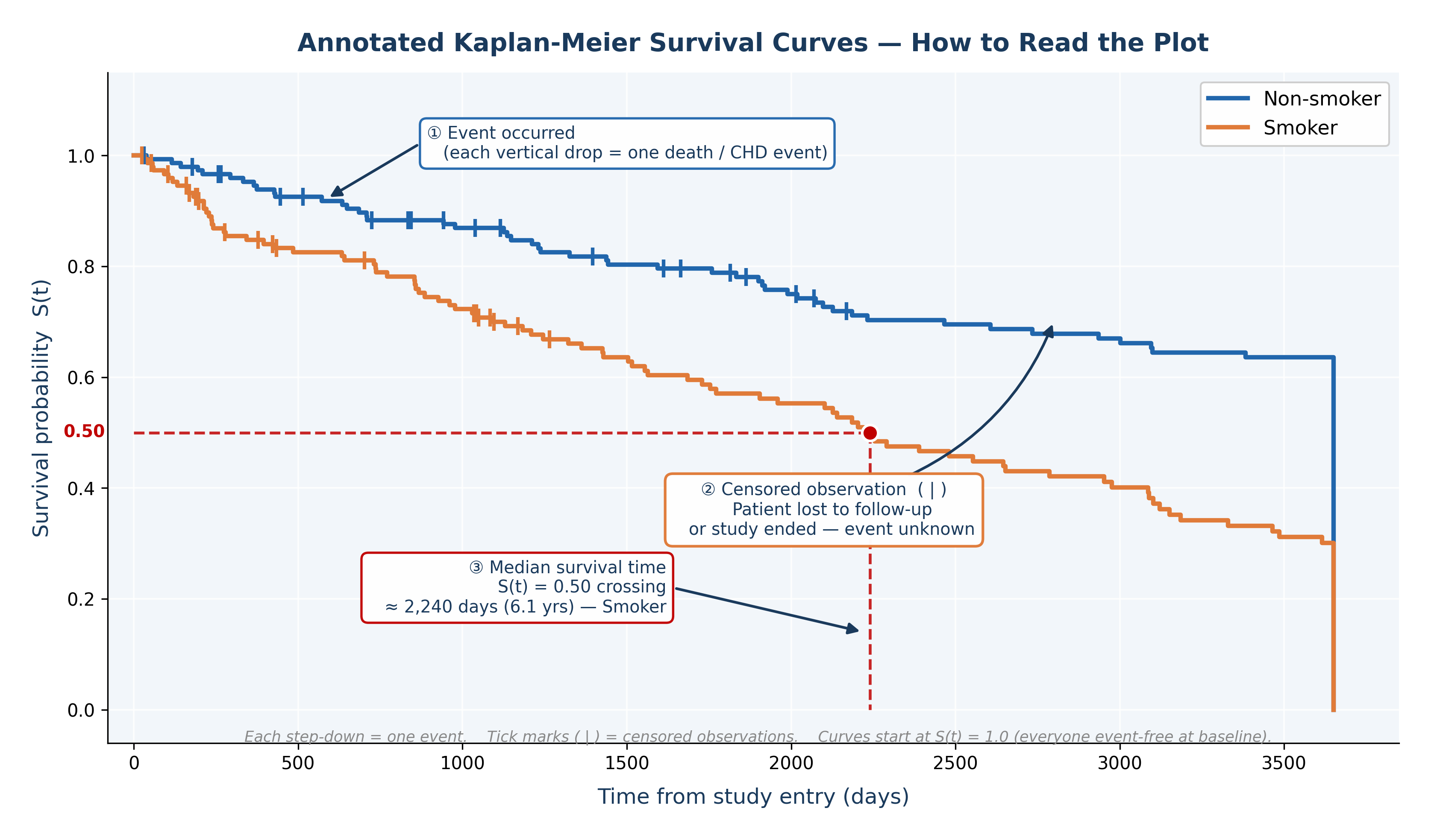
Fig. 24 Figure 8.3 Annotated Kaplan-Meier Survival Curves. ① Each vertical drop marks an event (death). ② Tick marks ( | ) on the curve indicate censored observations — patients who left the study or whose follow-up ended before the event occurred. ③ The median survival time is the point where the curve crosses S(t) = 0.50, shown here for the smoker group at approximately 2,240 days. Non-smokers did not reach median survival within the follow-up — their survival curve remains above 0.50 throughout, indicating a better prognosis.#
The resulting KM curve:
Starts at 1.0 (everyone is alive at baseline).
Steps downward only when a death event occurs.
Remains flat (with a vertical tick mark) when a censored observation occurs.
The median survival time is the exact point on the X-axis where the curve drops below 0.50 on the Y-axis.
3.3 The Log-Rank Test#
The log-rank test formally compares Kaplan-Meier curves between two or more groups.
Framingham research question: Does overall survival time differ between smokers and non-smokers?
\(H_0:\) The survival curves for smokers and non-smokers are identical.
\(H_1:\) The survival curves differ.
A significant log-rank test (\(p < 0.05\)) means the two groups have statistically different survival experiences. Combined with the KM plot, this provides both the statistical evidence and the visual clinical context.
🔬 Lab Manual — Chapter 8#
Objective#
Part 1: Correlation and regression — does AGE predict SYSBP? (Framingham) Part 2: Regression — does baseline weight predict final weight? (Anorexia) Part 3: Survival analysis — do smokers and non-smokers have different all-cause survival? (Framingham)
Option A — PSPP#
Correlation/Regression:
Analyze → Correlate → Bivariate → move
AGE,SYSBP,TOTCHOL,BMI→ tick Pearson + Spearman → OK.Analyze → Regression → Linear →
SYSBPas Dependent,AGEas Independent → Statistics → CI → Plots →*ZRESIDvs*ZPRED+ Normal probability plot → OK.
Option B — R / RStudio#
# -------------------------------------------------------
# Chapter 8 Lab: Correlation, Regression, and Survival
# -------------------------------------------------------

fram_data <- read.csv("data/framingham_teaching.csv")

# The survival package comes pre-installed with R, but must be loaded
library(survival)

# ══ Part 1: Correlation (Framingham) ═════════════════

# Scatterplot: AGE vs SYSBP
plot(fram_data$AGE, fram_data$SYSBP,
     main = "Age vs Systolic Blood Pressure",
     xlab = "Age (years)", ylab = "SYSBP (mmHg)",
     pch = 16, col = "#2166AC", cex = 0.7, alpha = 0.6)

# Pearson's r
cor.test(fram_data$AGE, fram_data$SYSBP, method = "pearson")

# Spearman's rho (for CIGPDAY — heavily skewed)
cor.test(fram_data$CIGPDAY, fram_data$TOTCHOL, method = "spearman")

# Correlation matrix
cor(fram_data[, c("AGE","SYSBP","DIABP","TOTCHOL","BMI","GLUCOSE")],
    use = "complete.obs")

# ══ Part 2a: Simple linear regression (Framingham) ═══

model <- lm(SYSBP ~ AGE, data = fram_data)
summary(model)

# Coefficients and Confidence Intervals
cat("Intercept (β₀):", round(coef(model)[1], 3), "\n")
cat("Slope (β₁):    ", round(coef(model)[2], 3), "mmHg/year\n")
cat("R-squared (R²):", round(summary(model)$r.squared, 4), "\n")
confint(model)

# Prediction: expected SYSBP for a 55-year-old
predict(model, newdata = data.frame(AGE = 55), interval = "prediction")

# Diagnostic plots
par(mfrow = c(2,2)); plot(model); par(mfrow = c(1,1))

# ══ Part 2b: Simple linear regression (Anorexia) ═════
library(MASS)
data(anorexia)

# Does baseline weight predict final weight?
model_wt <- lm(Postwt ~ Prewt, data = anorexia)
summary(model_wt)

# Plot the relationship
plot(anorexia$Prewt, anorexia$Postwt,
     main = "Baseline vs Final Weight",
     xlab = "Baseline Weight (lbs)", ylab = "Final Weight (lbs)",
     pch = 16, col = "#C00000")
abline(model_wt, lwd = 2)

# ══ Part 3: Survival analysis (Framingham) ═══════════

# Code smoking status
fram_data$SMOKE_LABEL <- factor(fram_data$CURSMOKE, levels=c(0,1),
  labels=c("Non-smoker","Smoker"))

# Create survival object
surv_obj <- Surv(time  = fram_data$TIMEDTH,
                 event = fram_data$DEATH)

# Kaplan-Meier curves by smoking status
km_fit <- survfit(surv_obj ~ SMOKE_LABEL, data = fram_data)
summary(km_fit)$table   # Median survival time per group

# Plot KM curves
plot(km_fit,
     main = "Kaplan-Meier Survival Curves by Smoking Status",
     xlab = "Time (days)", ylab = "Survival Probability",
     col  = c("#2166AC","#C00000"),
     lwd  = 2, conf.int = TRUE)
legend("bottomleft",
       legend = c("Non-smoker","Smoker"),
       col    = c("#2166AC","#C00000"), lwd = 2)

# Log-rank test
logrank_test <- survdiff(surv_obj ~ SMOKE_LABEL, data = fram_data)
print(logrank_test)
cat("Log-rank p-value:", round(1 - pchisq(logrank_test$chisq, df=1), 4), "\n")
What to examine:
Regression (Framingham): What is the slope (\(\beta_1\))? For each year of age, how much does predicted SYSBP increase?
Regression (Anorexia): Look at the \(R^2\) value for
model_wt. What percentage of the variance in a patient’s final weight is explained simply by how much they weighed at the start of the trial?Diagnostic plots: Do the residuals show a pattern? Is the Q-Q plot approximately diagonal?
KM curves: Do the smokers’ survival curves separate from non-smokers’ over time? Which group has the lower median survival?
Log-rank test: Is \(p < 0.05\)? Does smoking significantly reduce survival?
🧪 Test Your Knowledge#
(a) Run a regression with TOTCHOL as the outcome and AGE as the predictor. Write the regression equation and predict TOTCHOL for a 60-year-old.
(b) Run a KM analysis comparing survival between those with prevalent CHD at baseline (PREVCHD=1) and those without. State \(H_0\) and \(H_1\) for the log-rank test, run it, and interpret the outcome.
Show Solution
# (a) Regression: TOTCHOL ~ AGE
model_chol <- lm(TOTCHOL ~ AGE, data = fram_data)
summary(model_chol)
b0 <- coef(model_chol)[1]
b1 <- coef(model_chol)[2]
cat("Equation: TOTCHOL =", round(b0,1), "+", round(b1,3), "* AGE\n")
pred_60 <- b0 + b1 * 60
cat("Predicted TOTCHOL at age 60:", round(pred_60,1), "mg/dL\n")

# (b) KM with PREVCHD
fram_data$PREVCHD_LABEL <- factor(fram_data$PREVCHD, levels=c(0,1),
  labels=c("No prior CHD","Prior CHD"))

surv2 <- Surv(fram_data$TIMEDTH, fram_data$DEATH)
km2   <- survfit(surv2 ~ PREVCHD_LABEL, data = fram_data)
plot(km2,
     main = "Survival by Prevalent CHD at Baseline",
     col = c("#2166AC","#C00000"), lwd=2)
legend("bottomleft", legend=c("No prior CHD","Prior CHD"),
       col=c("#2166AC","#C00000"), lwd=2)

# H₀: survival curves are identical for those with and without prior CHD
# H₁: survival curves differ
lr2 <- survdiff(surv2 ~ PREVCHD_LABEL, data = fram_data)
print(lr2)
# Expected: patients with prior CHD have significantly worse survival (p < 0.05)
Key Terms#
Term |
Definition |
|---|---|
Pearson’s r |
Strength and direction of a linear association (−1 to +1). Sensitive to outliers. |
Spearman’s rho (\(\rho\)) |
Rank-based correlation. Use for heavily skewed or ordinal data. |
Extrapolation |
Dangerously using a regression model to predict outcomes outside the range of the observed data. |
Simple linear regression |
Models \(\hat{y} = \beta_0 + \beta_1x\). \(\beta_1\) = the change in \(y\) per unit increase in \(x\). |
\(R^2\) (R-squared) |
The proportion of variance in \(y\) explained by \(x\) (bounded between 0 and 1). |
Censored observation |
A participant whose event has not yet occurred by the end of follow-up. Time is recorded, but the true outcome time is unknown. |
Kaplan-Meier estimator |
A non-parametric estimate of survival probability over time that correctly handles censored data. |
Log-rank test |
Compares KM survival curves between groups. \(H_0\) = curves are identical. |
Review Questions#
Run
cor.test(fram_data$AGE, fram_data$SYSBP)in R. Report r, the p-value, and the 95% CI. Write a one-paragraph interpretation including the difference between correlation and causation.Fit
lm(SYSBP ~ AGE). Write the regression equation. Predict SYSBP for participants aged 40 and 65. Is it valid to predict for a participant aged 25? Explain using the concept of extrapolation.Using the Anorexia dataset, look at the output of
lm(Postwt ~ Prewt). If a patient weighed 85 lbs at baseline, what is their predicted weight at follow-up based on this model?Explain why OLS regression (
lm(TIMEDTH ~ CURSMOKE)) would give a biased, invalid answer for the question “does smoking reduce survival time?” What is the correct statistical method to use?Run the KM analysis comparing survival by smoking status. Describe the visual curves: which group has worse survival? What is the approximate median survival time for each group?
The log-rank test returns \(\chi^2(1) = 3.8\), \(p = 0.051\). Interpret this result. At \(\alpha = 0.05\), what do you conclude? What would a statistical power analysis suggest about this borderline result?
Key Takeaways
Pearson’s r (−1 to +1): measures the strength and direction of a linear association.
Spearman’s rho (\(\rho\)): use for skewed continuous data or ordinal variables.
Regression: \(\hat{y} = \beta_0 + \beta_1x\). \(\beta_1\) = change in \(y\) per unit of \(x\). \(R^2\) = proportion of variance explained.
Do NOT use OLS regression on censored survival data — use the Kaplan-Meier estimator + log-rank test.
KM curve: steps down at each death; median survival = the time where the curve crosses 0.50.
Log-rank test: formally tests whether two KM curves are statistically different from one another.
Next: Chapter 9 — The Full Picture consolidates all methods and provides examination preparation.
Part III — Comparing More Than Two Groups